The past couple of months I have been working with Davey & Krista on a Bright Occasions rebrand, and I’m so excited to share the new look! After being in business since 2011, and realizing that the old look doesn’t quite fit the style and vibe we want to convey with clients, now seemed like a perfect time to refresh our brand. I first met Krista for a wedding back in 2013 where she and Davey were the photographers. And I’ve been a fan ever since. Side note for those in the event industry,I love their podcast (Brands that Book), where they have different professionals in the creative industry on to cover a variety of great branding and business topics.
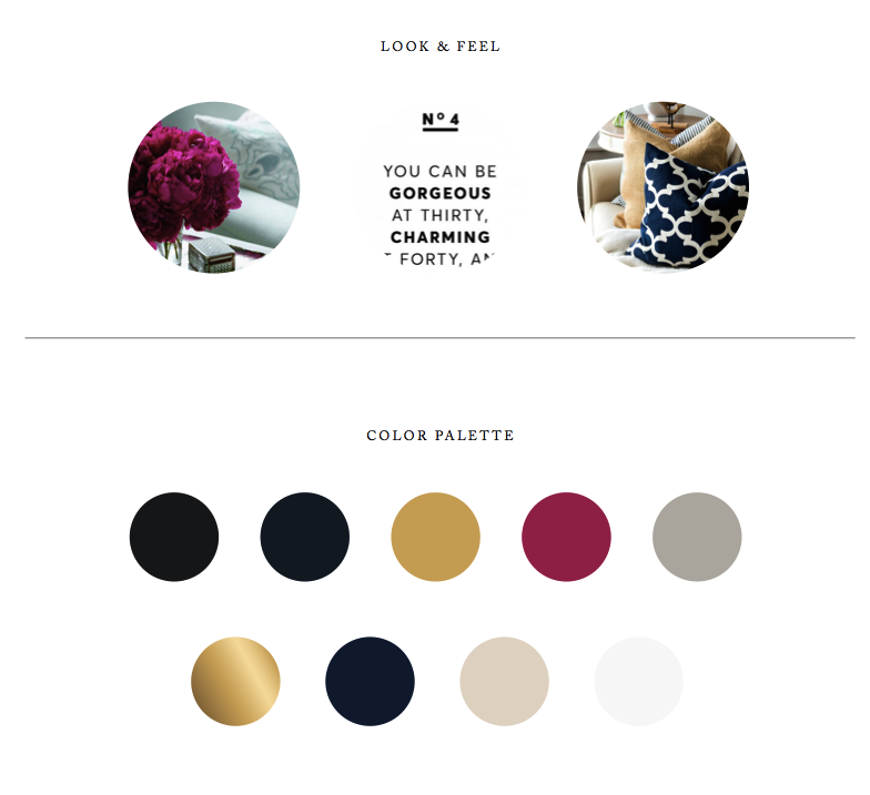
Davey & Krista and their team made the rebrand process so easy and seamless and nailed the look I was going for. I wasn’t sure which direction I wanted to go in for logo or colors, and after completing their questionnaire they came up with a first draft brand board that when I saw it felt so right and just like me and our brand. So without further ado, here is the new logo and brand board!


The main logo colors are navy and gold, which are elegant and classic choices. And I love that the font selection feels feminine, a bit modern, yet still timeless. For the other colors in the look, I love the neutrals combined with a pop of color with the raspberry shade, which is definitely a romantic color choice for our brand. I plan to start a website update with Davy & Krista next and will definitely be incorporating the color palette they have designed for Bright Occasions.
![]()
In addition to the main logo, they came up with some alternate icon options that I can use on my new website, on business cards or stationery and social media. I am especially drawn to the ranunculus icon, which is a favorite flower and one that we often incorporate into floral designs for our clients.

While I’m partial to the gold and can already picture it looking so beautiful done in gold foil on stationery, I also love that they gave me this image with a white logo on a navy background. It really pops and looks great. I’m excited about a logo that is versatile and will look good in a few ways. And it makes me excited to update my website and other branding materials. Thanks again to the team at Davey & Krista for designing a perfect new look for Bright Occasions!

[contact-form][contact-field label=”Name” type=”name” required=”true” /][contact-field label=”Email” type=”email” required=”true” /][contact-field label=”Website” type=”url” /][contact-field label=”Message” type=”textarea” /][/contact-form]